William Dunlop Lecture Series Spring 2026: Martin Venezky Promo poster.
Ar/print poster
event promo
Creative scholarship


Fonts in use ::: News Gothic
AR Artivive ::: Riva Nayaju


Instagram Reel.
Poster design for the inaugural William Dunlop Lecture Series, a biannual program bringing distinguished designers and creative practitioners to Auburn each fall and spring. The series aims to enrich the educational experience of students, faculty, and the broader university community. This 2026 Spring lecture featured Martin Venezky, an artist, photographer and designer exploring relationships between objects, form, drawing and the image. His work shifts scale from intimate gatherings of discarded objects to expansive wall-sized installations. The program includes a public lecture, a gallery talk, and an exhibition of Venezky’s work.
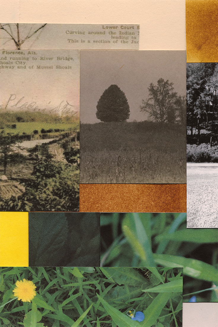
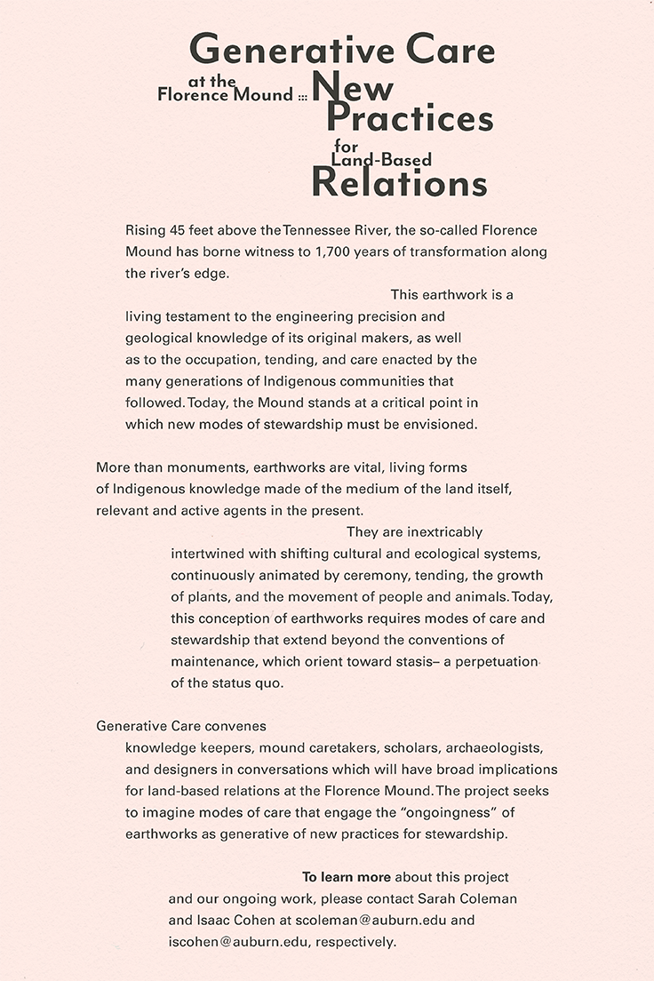
Generative Care at the Florence Mound: New Practices for Land-Based Relations. Workshop & Symposium. Poster + Postcard/Leave-behind
event promo
Creative scholarship
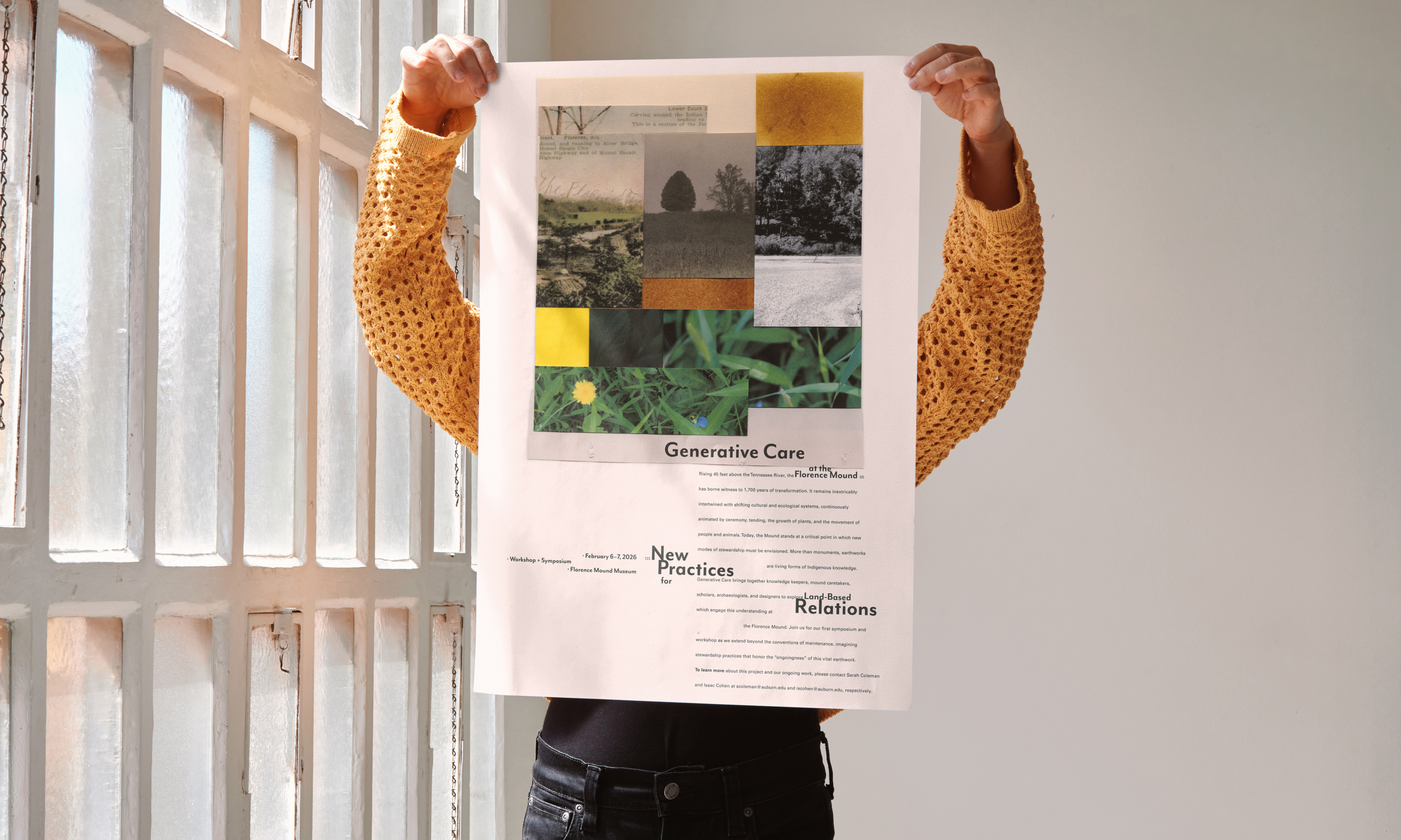
Poster printed on archival cold-press textured paper.
Clients: Sarah Coleman + Isaac Cohen, Landscape Architects / Educators at the School of Architecture, Planning and Landscape Architecture. Auburn University.
Front + Back 4”×6” Postcard/Leave-behind. Printed on textured matte cardstock paper. Fonts in use ::: Mr. Eaves + Univers.
Generative Care convenes knowledge keepers, mound caretakers, scholars, archaeologists, and designers in conversations which will have broad implications for land-based relations at the Florence Mound (AL). The project seeks to imagine modes of care that engage the “ongoingness” of earthworks as generative of new practices for stewardship. The symposium and workshop will collectively envision what it means to care for this vital earthwork.
Finalized composition + Scanning prep.
Finalized composition + Scanning prep.
Auburn University | Photo Communications Summer 2025 Course Poster
Creative scholarship
︎
2026—Honorable Mention in the Graphis 2026 poster awards competition︎︎︎ International.


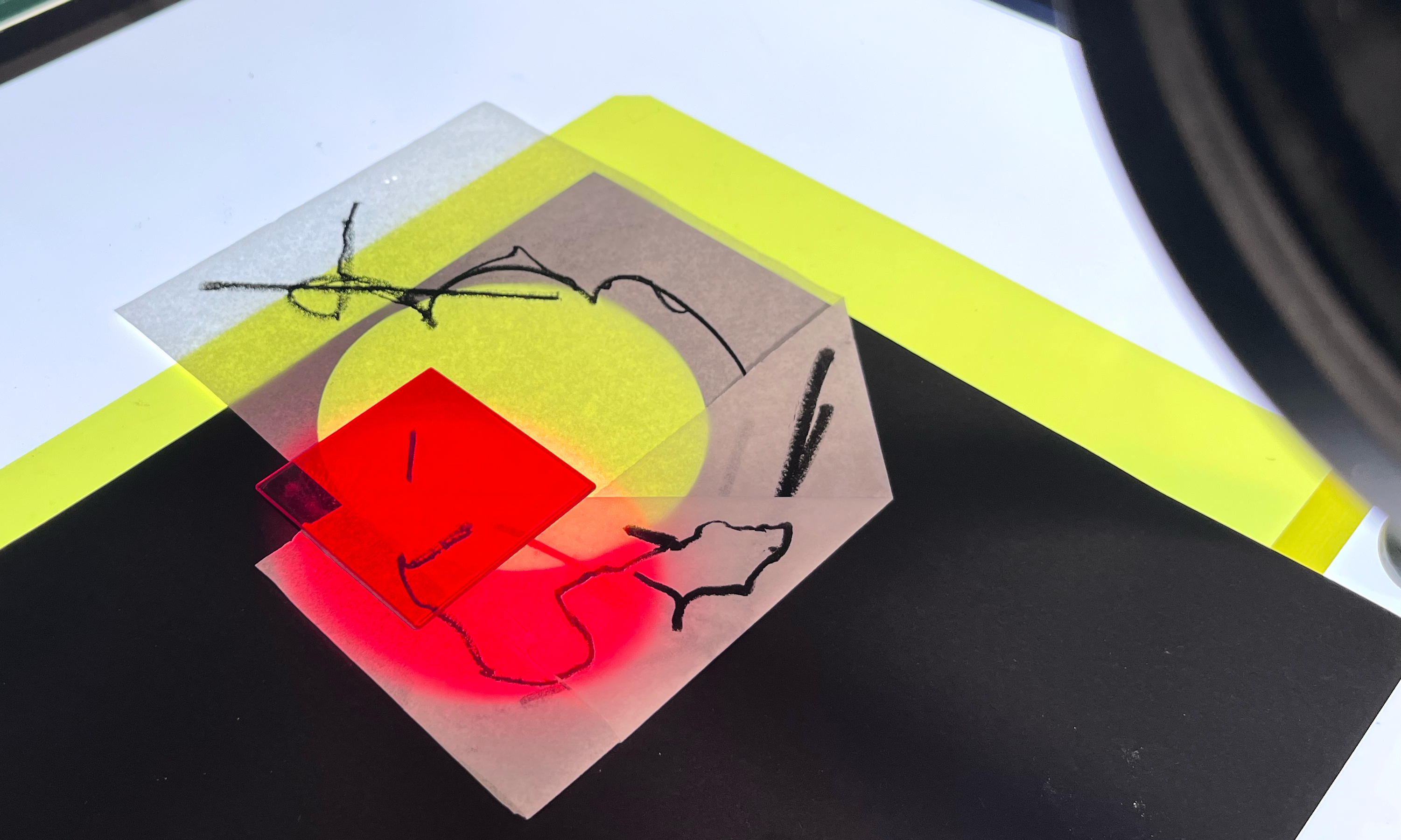
The poster was assembled using analog processes, combining gelli plate/spray paint textures, typography from found printed materials, and abstract photography of light and shadow. Its layered composition captures the spontaneity of tactile methods, reflecting the course’s exploration of experimental image-making through chance operations and purposeful play.
![]()
![]()
A photocopier was used to manipulate the course information, adding unique distortion and texture to each letterform, while embracing the beauty that emerges when inexactness becomes a design tool. These techniques reinforce the course’s philosophy of using experimentation to expand creative thinking beyond the computer while employing the camera as an exploratory tool to discover unexpected results.
Fonts in use ::: Univers (course information)
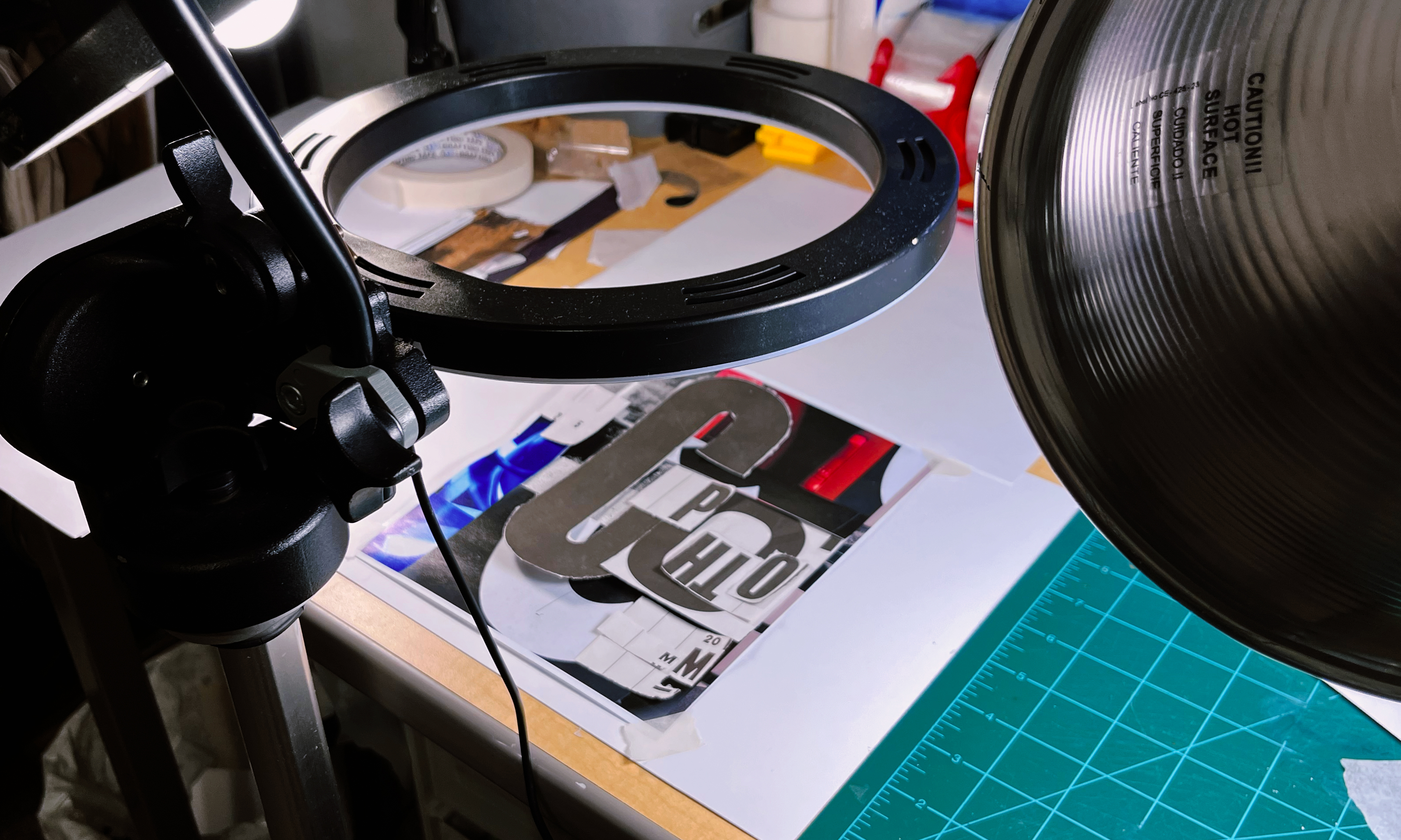
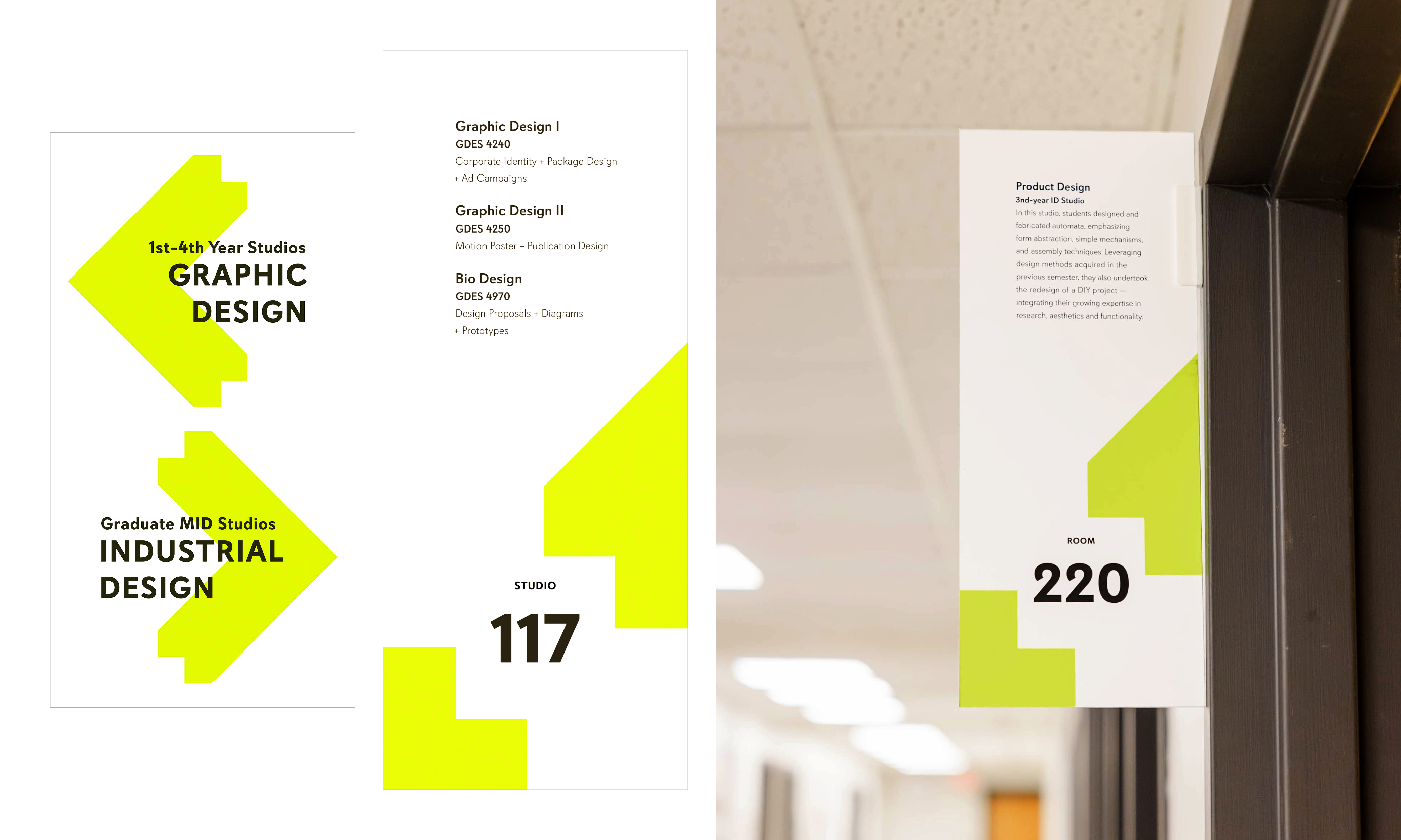
Kaleidoscope : Auburn Design Show
Event branding
Motion Design
collaboration/Creative scholarship
︎
2025— Professional-Honorable Mention. Graphex #56 (Art Directors Club of Tulsa).
2025—Poster selected for the Bienal de Diseño y Cartel Bolivia BICeBé︎︎︎. Category: E-Motion Design Poster. International.
2024—Winner. 61st Anniversary Graphic Design USA︎︎︎ Inhouse Design Awards. National.

The Greek origins of the word Kaleidoscope—"kalos" (beautiful), "eidos" (form), and "scope" (to look or examine)—allowed us to experiment and inspire a dynamic visual language for the inaugural Auburn student design show.
The bright green and plus glyph are at the heart of the identity. The "kalos-green" embodies the learning journey of our student’s creative energy, growth, and innovation. The plus is a staple mark of our school. To amplify its role and conceptual connection to the show, the plus dynamically extrudes and moves in various directions, much like the continuous form transformations when looking through a kaleidoscope—echoing the creative process, where ideas evolve and expand in multiple dimensions. The kinetic plus resembles the fluid nature of design, where each perspective offers new and intriguing patterns, leading to unexpected and beautiful outcomes.
Font in use ::: Davis Sans.
Kalos green ::: Pantone 389C (Lee Clark).
main Promo video
In Spring 2024 I teamed with 3 graphic design professors and 2 industrial design professors to help organize and design the identity for the first school-wide design show. This event featured new designs from the Spring semester at all levels of the graphic and industrial design programs. All the studios in Wallace Hall were transformed into exhibition spaces. In each studio, all professors, support staff, and students worked together to arrange the best student artwork, ensuring that the venue was filled with creativity and professionalism.
Creative/Art director: Mario F. Bocanegra Martinez
—
Event program and lanyard design: Courtney Windham, GDes.
—
Web design: Devon Ward, GDes.
—
Sticker design/Color system: Lee Clark, GDes.
—
Wayfinding design: Jerrod Windham, InDust.
—
Award design: Zach Kohrman, InDust.
—
Event program and lanyard design: Courtney Windham, GDes.
—
Web design: Devon Ward, GDes.
—
Sticker design/Color system: Lee Clark, GDes.
—
Wayfinding design: Jerrod Windham, InDust.
—
Award design: Zach Kohrman, InDust.


Barneveld Congregational
Logo design
Freelance
︎
2026—Honorable Mention in the Graphis 2026 design awards competition︎︎︎ International.
2025—Creative Quarterly 79 Runner-up. International.

The new logo of Barneveld Congregational is a harmonious combination of Christian symbols and visual storytelling designed to deeply connect with believers in Jesus Christ.
The logo consists of two quotation marks facing each other, forming a cross, a cup, and a mountain peak at their intersection. This imagery is a reminder of unity, faith, and the enduring power of shared beliefs. The use of quotation marks is a tribute to the written word of God. At the bottom of the cross, the cup represents Jesus' acceptance of God's divine will and selfless sacrifice. At the bottom of the cup, a majestic mountain peak reaching the blue heavens inspires a sense of serenity, tranquility, and divine presence.
Church based in Barneveld, Wisconsin.
Wordmark ::: Univers LT Std 57 Condensed